Bootstrap Table Tutorial
Overview
Tables are available in the majority of the apps (web, desktop or mobile application) and they are a key component in providing data to the final user. The HTML tables are actually used to present information in framework way like rows and columns . With using Bootstrap 4 framework you are capable to easily increase the look of the table.
In the present day, with the importance that the user interface has, understanding precisely how to enhance the look of a Bootstrap Tables Pricing comes to be as relevant as it is. In this situation, one of the technologies that have become reference is Bootstrap. This front-end framework, among many other features , delivers a number of features for styling and optimising the display of various elements, such as tables.
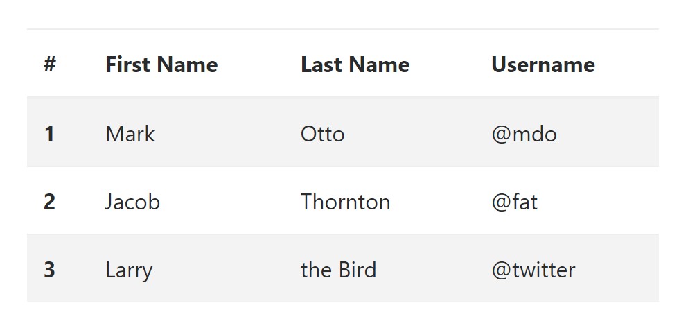
Classic table in Bootstrap
To design a table by using Bootstrap, just simply add the table class to the <table> tag, and a number of visional formatting will just be applied , as presented on the screenshot .
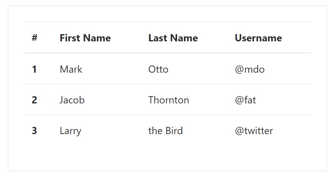
<table class="table">
  <thead>
    <tr>
      <th>#</th>
      <th>First Name</th>
      <th>Last Name</th>
      <th>Username</th>
    </tr>
  </thead>
  <tbody>
    <tr>
      <th scope="row">1</th>
      <td>Mark</td>
      <td>Otto</td>
      <td>@mdo</td>
    </tr>
    <tr>
      <th scope="row">2</th>
      <td>Jacob</td>
      <td>Thornton</td>
      <td>@fat</td>
    </tr>
    <tr>
      <th scope="row">3</th>
      <td>Larry</td>
      <td>the Bird</td>
      <td>@twitter</td>
    </tr>
  </tbody>
</table>
Inverse tables.
One of the latest tables in Bootsrap 4 is the inverse tables. Class .table-inverse can easily replace the colouring of the table.
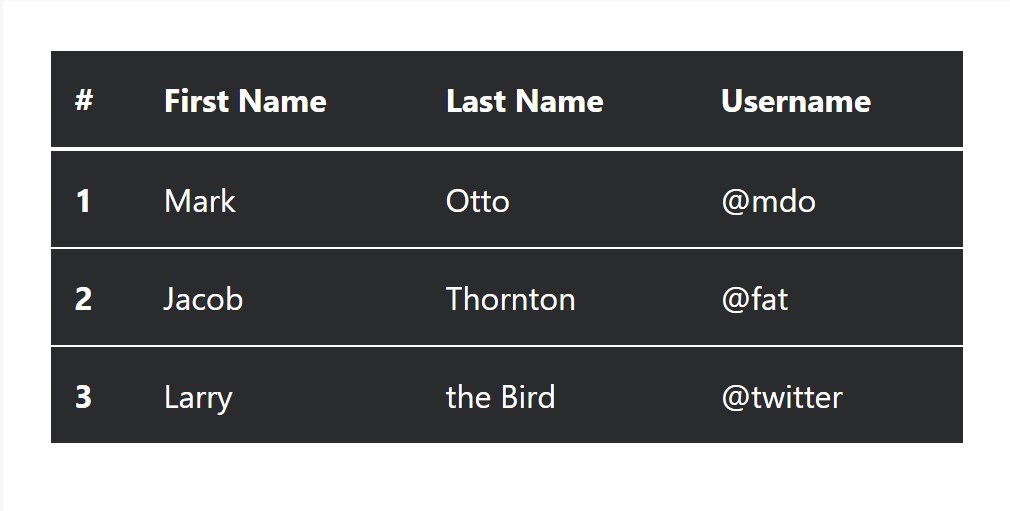
<table class="table table-inverse">
  <thead>
    <tr>
      <th>#</th>
      <th>First Name</th>
      <th>Last Name</th>
      <th>Username</th>
    </tr>
  </thead>
  <tbody>
    <tr>
      <th scope="row">1</th>
      <td>Mark</td>
      <td>Otto</td>
      <td>@mdo</td>
    </tr>
    <tr>
      <th scope="row">2</th>
      <td>Jacob</td>
      <td>Thornton</td>
      <td>@fat</td>
    </tr>
    <tr>
      <th scope="row">3</th>
      <td>Larry</td>
      <td>the Bird</td>
      <td>@twitter</td>
    </tr>
  </tbody>
</table>
Extra classes
For tables there are also some classes that help you to add various styles to a table, they are:
● table-striped Toggles the color tone of table rows;
● table-bordered Adds border to table;
● table-hover Switches on the highlight of a Bootstrap Table Data line when we hover the mouse pointer over it;
● table-condensed Reduces the height of table rows, making it more compact.
To apply all of these looks, just add in the chosen classes to the: <table>: <table class="table table-striped table-bordered table-condensed table-hover">
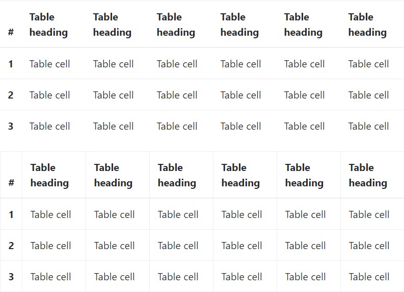
Table head possibilities
Just like default and inverse tables, choose one of two modifier classes to make <thead> show up dark or light gray.
img
<table class="table">
  <thead class="thead-inverse">
    <tr>
      <th>#</th>
      <th>First Name</th>
      <th>Last Name</th>
      <th>Username</th>
    </tr>
  </thead>
  <tbody>
    <tr>
      <th scope="row">1</th>
      <td>Mark</td>
      <td>Otto</td>
      <td>@mdo</td>
    </tr>
    <tr>
      <th scope="row">2</th>
      <td>Jacob</td>
      <td>Thornton</td>
      <td>@fat</td>
    </tr>
    <tr>
      <th scope="row">3</th>
      <td>Larry</td>
      <td>the Bird</td>
      <td>@twitter</td>
    </tr>
  </tbody>
</table>

<table class="table">
  <thead class="thead-default">
    <tr>
      <th>#</th>
      <th>First Name</th>
      <th>Last Name</th>
      <th>Username</th>
    </tr>
  </thead>
  <tbody>
    <tr>
      <th scope="row">1</th>
      <td>Mark</td>
      <td>Otto</td>
      <td>@mdo</td>
    </tr>
    <tr>
      <th scope="row">2</th>
      <td>Jacob</td>
      <td>Thornton</td>
      <td>@fat</td>
    </tr>
    <tr>
      <th scope="row">3</th>
      <td>Larry</td>
      <td>the Bird</td>
      <td>@twitter</td>
    </tr>
  </tbody>
</table>
Striped rows
Zebra-like stripes can be brought in with the .table-striped class, an good example
<table class="table table-striped">
<thead>
<tr>
<th>#</th>
<th>First Name</th>
<th>Last Name</th>
<th>Username</th>
</tr>
</thead>
<tbody>
<tr>
<th scope="row">1</th>
<td>Mark</td>
<td>Otto</td>
<td>@mdo</td>
</tr>
<tr>
<th scope="row">2</th>
<td>Jacob</td>
<td>Thornton</td>
<td>@fat</td>
</tr>
<tr>
<th scope="row">3</th>
<td>Larry</td>
<td>the Bird</td>
<td>@twitter</td>
</tr>
</tbody>
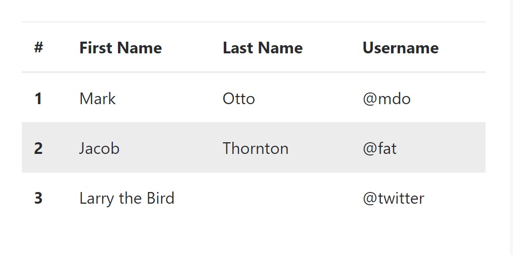
</table>Hover Rows
To make a hover side effect in the rows of your table incorporate the .table-hover class:
<table class="table table-hover">
<thead>
<tr>
<th>#</th>
<th>First Name</th>
<th>Last Name</th>
<th>Username</th>
</tr>
</thead>
<tbody>
<tr>
<th scope="row">1</th>
<td>Mark</td>
<td>Otto</td>
<td>@mdo</td>
</tr>
<tr>
<th scope="row">2</th>
<td>Jacob</td>
<td>Thornton</td>
<td>@fat</td>
</tr>
<tr>
<th scope="row">3</th>
<td colspan="2">Larry the Bird</td>
<td>@twitter</td>
</tr>
</tbody>
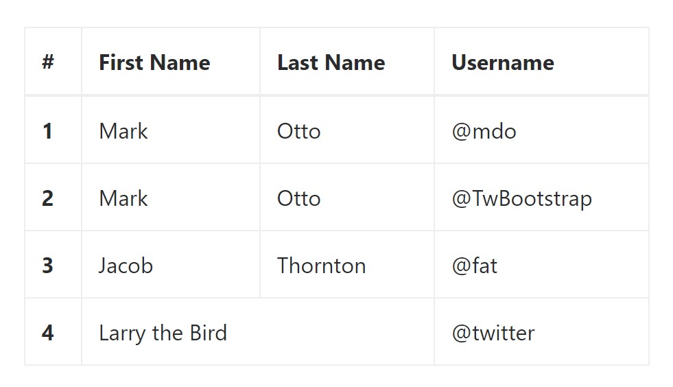
</table>Bordered Table
You can easily provide the borders on each table slide and a cell by having the .table-bordered class:
<table class="table table-bordered">
<thead>
<tr>
<th>#</th>
<th>First Name</th>
<th>Last Name</th>
<th>Username</th>
</tr>
</thead>
<tbody>
<tr>
<th scope="row">1</th>
<td>Mark</td>
<td>Otto</td>
<td>@mdo</td>
</tr>
<tr>
<th scope="row">2</th>
<td>Mark</td>
<td>Otto</td>
<td>@TwBootstrap</td>
</tr>
<tr>
<th scope="row">3</th>
<td>Jacob</td>
<td>Thornton</td>
<td>@fat</td>
</tr>
<tr>
<th scope="row">4</th>
<td colspan="2">Larry the Bird</td>
<td>@twitter</td>
</tr>
</tbody>
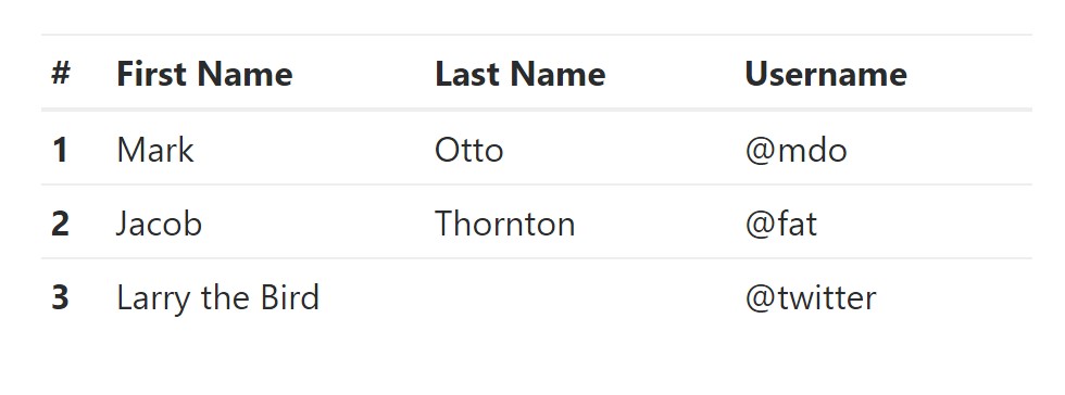
</table>Condensed Table
In case that you intend to make your table much more small - then you are able to cut cell padding in half by having this class: .table-condensed.
Take note that, while Bootstrap 4 uses .table-sm to condense a table, Bootstrap 3 uses .table-condensed. Each cut cell padding in half.
<table class="table table-sm">
<thead>
<tr>
<th>#</th>
<th>First Name</th>
<th>Last Name</th>
<th>Username</th>
</tr>
</thead>
<tbody>
<tr>
<th scope="row">1</th>
<td>Mark</td>
<td>Otto</td>
<td>@mdo</td>
</tr>
<tr>
<th scope="row">2</th>
<td>Jacob</td>
<td>Thornton</td>
<td>@fat</td>
</tr>
<tr>
<th scope="row">3</th>
<td colspan="2">Larry the Bird</td>
<td>@twitter</td>
</tr>
</tbody>
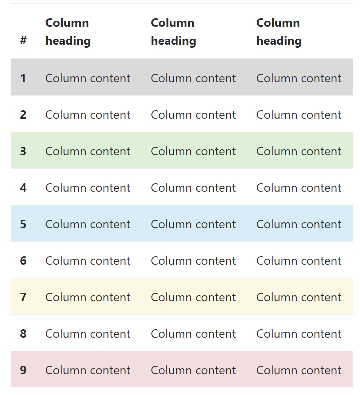
</table>Contextual Classes of Bootstrap Tables Striped
Use the contextual classes to color a table cells (<td>) and table rows (<tr>):
<!-- On rows -->
<tr class="table-active">...</tr>
<tr class="table-success">...</tr>
<tr class="table-warning">...</tr>
<tr class="table-danger">...</tr>
<tr class="table-info">...</tr>

<!-- On cells (`td` or `th`) -->
<tr>
  <td class="table-active">...</td>
  <td class="table-success">...</td>
  <td class="table-warning">...</td>
  <td class="table-danger">...</td>
  <td class="table-info">...</td>
</tr>
Changing the rows of a table Bootstrap 3 doesn't use the .table- prefix for its contextual classes. Bootstrap 3 uses .active whereas Bootstrap 4 uses .table-active.
● active: Uses the focus color tone to the table row or table cell
● success: Signifies a positive or successful action
● info: Signifies a neutral information change or action
● warning: Signifies a warning that you may need attention
● danger: Signifies a dangerous or potentially negative action
Responsive Tables
To create a responsive table - use the .table-responsive class. Table scrolls in the horizontal way on devices that less than 768px. If the device is larger sized than 768px wide, then you will see no difference :
Bootstrap 4 allows you to add the .table-responsive class to the actual <table> element. Bootstrap 3 tables required that you add that class to a parent <div> element.
Review a few online video training about Bootstrap 4 tables
Connected topics:
Bootstrap tables: official documentation
W3schools:Bootstrap table tutorial